Make Augusta National Golf Club Look Bad Contest Winner Announced
Congratulations are in order to “Your Golf Travel” for winning the first annual “Make Augusta National Golf Club Look Bad” contest! Check out this beauty of a photo:
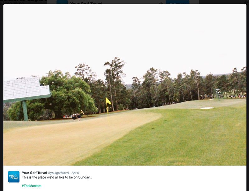
Let’s analyze the genius of this photo. How many different ways could they make the world’s most beautiful golf course look so terrible?
- Photograph at a 29.7 degree tilt to the left, to make the view nauseated and dizzy
- Make greens look dried and burned out
- Make fairway look dried and burned out
- Overexpose photo so skies look like a nuclear white-out
- Position photo so 50% of the content is the overexposed nuclear white-out
- Shoot photo at such a low resolution that the trees in the background completely pixelate into digital gibberish
There you have it. Congratulations to Your Golf Travel! Email me to collect your prize, a free PDF on the basics of digital photography.







And yet, for all their incompetence, they likely get ten times the visits and social juice that we do.
Well, they’re a travel company and they pay a lot of money for social outreach and SEO, so probably.