Golf Channel Wins Award for Worst Photoshop of Payne Stewart
Categories: Boneheads • Golf Media
Tags: Golf Channel • Payne Stewart
This week’s “bonehead of the week” goes to Golf Channel. I’m fairly sure that Payne Stewart did in fact have two feet. Not a good photoshop job.
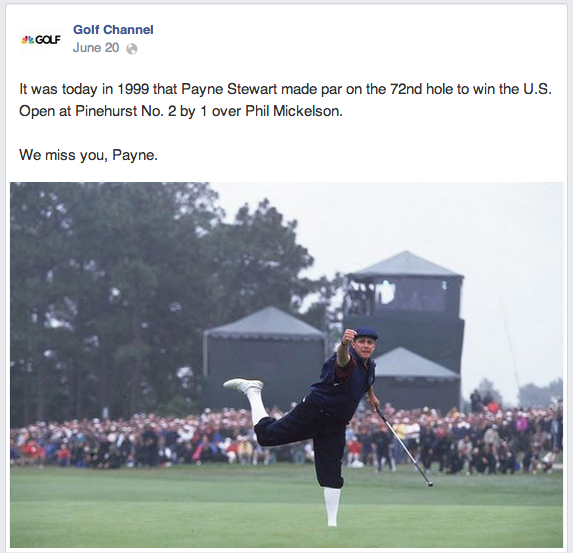
Bugger! Where did his foot go?
Also odd that the image is sort of foggy, yet Payne is standing out crystal clear…
UPDATE
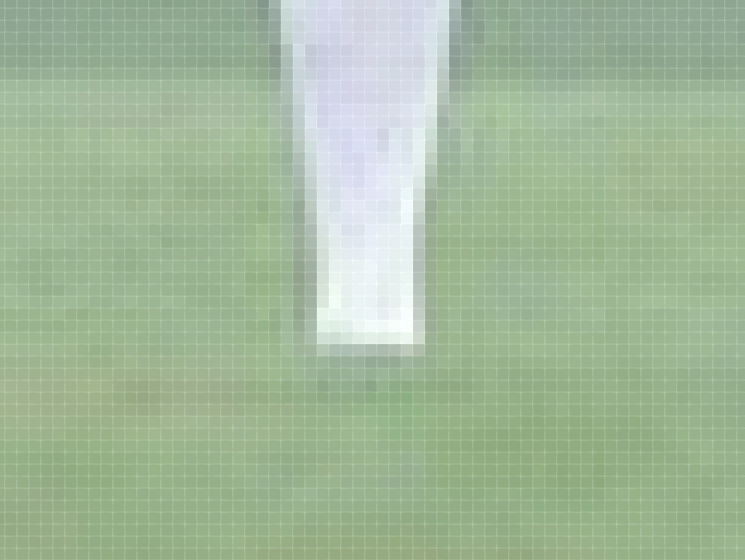
Thanks to reader PJ_ONeal for commenting. PJ believes (see comments below) that this is not a photoshop fail, but likely a camera angle in which Payne’s foot was chopped off. I disagree, based on years of graphic design and photoshop. Plus, there’s nothing in the same area of the green to indicate a different level. For fun I did look closer at the image in photoshop:
Here’s a shot from another angle…

Still looks like a bad photoshop to me. But if I’m wrong I’d love to hear about it. I’m more than willing to take a lump if it is deserved.









Interesting accusation Tony, especially since the exact same image appears (the AP claims credit) on a June 11, 2009 Sports Illustrated article: http://www.golf.com/tour-and-news/payne-relief-payne-stewart-reverses-narrow-loss-us-open-and-wins-scintillating-showdow
Wow interesting PJ. So there are other issues at play. The AP source is a complete photoshop hack job. Second, GC still ran the photo.
Perhaps Payne is simply standing in a low area, relative to the camera, with a rise between. There are certainly plenty of humps and bumps on those greens! Unless you’ve done pixel-level analysis of the image, I’m not sure you can jump to a photoshop assumption.
You make a decent argument. I do however happen to be a photoshop expert. I work in PS 8+ hours/day.
Check the pixel-level analysis I added to the post and the additional photo. Let me know your thoughts.
Maybe as they superimposed him in another area of the course, they made a clumsy attempt to make it look like he’s standing in the deep rough (as it used to be) 🙂
OK Tony, I’ve done a bit more research on this. Payne’s birdie putt on 18 is dead uphill; it rises a good 12 to 14 inches, plenty of slope to obscure his left foot from a low angle camera shot that is right on his putting line. Here (https://www.youtube.com/watch?v=W73EMm33kds) is a short YouTube video and if you go to the :56 second position, you’ll see his approach shot and where the ball lands, which is right at the base of the slope. The camera shot is essentially right on his putting line as evidenced by his famous fist pump toward the hole aiming right at the camera in your image.
Now, you have to ask “why would the AP Photoshop this image?” Especially one with as sensitive a subject as Payne Stewart? In fact, the only reason I can think of to employ PS to this image is to ADD his left foot. I’ll bet the photographer was more than a little disappointed that his foot was obscured like that. In addition, the Associated Press, probably the leading news organization on the planet, having multiple people be responsible for such an important image and ALL OF THEM missed the fact that their PS work cut off Payne’s left foot??? It doesn’t make any sense. Clearly, the drop dead easiest explanation is simply the contour of the putting green.
I have written to the AP requesting any information they might have to support either side of this issue. I don’t expect to hear back from them, but if I do, I’ll relay it to you.
Am I going overboard with this? Perhaps; but, your claim is so outrageous to me that I can’t seem to let it go. All in good fun!
You’ve spent so much time and effort on it. I should award you the victory on this discussion based solely on that.
If they do respond and it is in fact not photoshopped, would acknowledging it be enough? Would I have to award myself a bonehead of the week for incorrectly awarding the bonehead of the week?
The shades of grass are exactly the same above, below and to each side (look at the zoomed image) of Payne’s leg. Not even the slightest change in color, line or definition at the point where his leg is cut off. A freak photo, if in fact it is not photoshopped. Pixel level analysis also shows his leg cut off PERFECTLY horizontal. If not photoshopped, the camera would had to have been exactly aligned horizontally with the slope of the grass in front of Payne’s foot, and the slope would have to be perfectly straight at that point. Once again, possible and also a freak photo if not photoshopped. There is also some aliasing/glow around Payne’s edges, especially below his right leg. Having knocked out many images from a background in photoshop in the past, that glow around the edges can be a byproduct.
I seem to have a problem with comments. Some comments here did not appear. I hope it is now fixed.