New HookedOnGolfBlog.com Site Design Optimized for Mobile, Tablet and Desktop
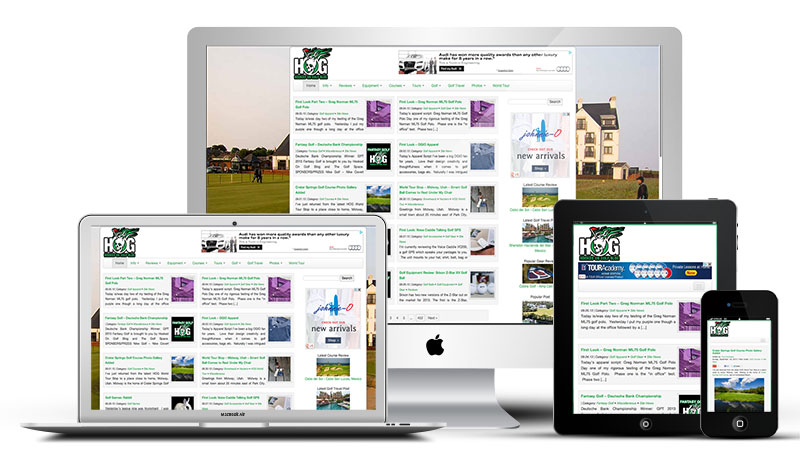
As you may have noticed, I’ve changed the design here at Hooked On Golf Blog. I’m not only a golf blogger, but I’m a web designer/programmer. I’ve been working on a new theme for use here which employs what’s called a “responsive” design. Responsive designs adapt to the screen sizes of the devices they’re being viewed on (see picture below).
The goal of this design is to make sure HOG looks great on desktop browsers of any size, all tablets and smartphones. If you look at HOG on any of your devices, the layout should automatically change to a viewer/device-friendly design.
Should…
I’ve flipped the switch and the new design is live but it is not without issues and bugs which need to be addressed. That process may take me a while! I’m open to suggestions, bug reports and constructive criticism. Let me know if you have issues or would like to see something changed.
I use the WordPress blogging software which is great. Yes, I could have simply downloaded someone else’s WordPress theme/design, but I like the challenge of building my own layout from scratch. That way I can eliminate stuff I don’t want, and I’ll never have issues if the template or functions of the site become obsolete or cease functioning.
The site format change applies to the blog section of the site so far. I have yet to address the Hooked On Golf Blog golf photo gallery, which is still the same as before. Once I’m satisfied with the blog layout, I’ll see if I can adapt the gallery section to the same design.

